Mise à niveau anticipée
Donnez à WestJet Les membres Gold et Premium l'opportunité de surclasser leur cabine 48 heures avant leur vol au lieu de 24 heures pour un meilleur tarif.
Expérience utilisateur • Interface utilisateur • Recherche • Architecture de l'information • Prototypage
Donnez à WestJet Les membres Gold et Premium l'opportunité de surclasser leur cabine 48 heures avant leur vol au lieu de 24 heures pour un meilleur tarif.
Expérience utilisateur • Interface utilisateur • Recherche • Architecture de l'information • Prototypage
About
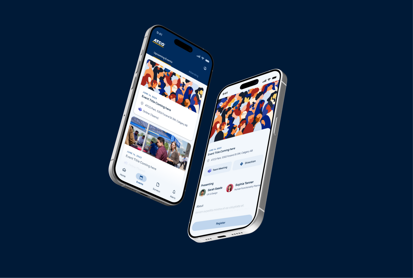
This application was primarily designed for students at ATCO, with the goal of creating a fun and engaging experience while staying consistent with the company’s branding. It is fully responsive, allowing access via mobile or web, and was developed using Flutter with Material 3 design principles (MUI), integrated with ATCO’s IDES design system.
One of the main challenges was making the app both engaging and interactive for a younger audience while maintaining alignment with corporate standards. I focused on playful animations and interface elements that made the app enjoyable to use, while keeping the experience intuitive and professional.
User Interviews & Feedback:
Although the initial version of the app was designed without extensive user testing due to time constraints, we conducted a series of short qualitative interviews with three students to validate early assumptions and gather initial feedback. These conversations provided valuable insight into how students perceived the product and how it might fit into their day-to-day experience within ATCO.
Overall, the feedback was highly positive. Participants consistently praised the look and feel of the application, describing it as modern, intuitive, and aligned with their expectations of an internal student platform. Most students indicated that they would primarily use the mobile version of the app, emphasizing convenience and accessibility while on the go as a key factor in their usage.
Students were particularly enthusiastic about the app’s ability to help them connect more easily with other students and facilitators. They noted that this feature could significantly reduce the sense of isolation that often comes with being a student in a large organization, and saw the app as a central hub for building community, staying informed, and feeling more engaged.
One recurring request that emerged during the interviews was the ability to indicate Work From Home availability within their profile. This reflected the reality of flexible work arrangements and the importance of visibility and coordination among peers. In response, this feature was incorporated into the design, enhancing personalization and making the app more relevant to students’ daily workflows.
These early interviews helped confirm that the app was addressing core student needs while also revealing opportunities to further refine engagement and profile-based features in future iterations.

Concept Validation
To validate the initial concept, we created a vision video to help the business better understand the proposed direction. Alongside early low-fidelity explorations, we shared a high-fidelity video concept that demonstrated how the app would look, feel, and function. This approach allowed stakeholders to clearly visualize the experience and align on the product vision before moving forward.
See below the story board and proposed video concept that was validated, after which we began designs and development work.
My Role & Contributions
-
Designed the responsive interface and ensured consistency with ATCO’s design system.
-
Collaborated closely with developers to leverage reusable components, enabling rapid MVP delivery.
-
Developed interactive and animated elements to make the app visually appealing to students.
-
Identified and addressed key user pain points, such as isolation and difficulty tracking feedback.
-
Oversaw design decisions to ensure alignment between the mobile app and web platform.
Challenges Along the Way
This project was developed under tight time and resource constraints.
Ideally, additional time would have allowed for more usability testing and user interviews. Despite these limitations, we were still able to conduct key research sessions that validated our core assumptions and informed important design decisions.
It’s also important to note that this release was an MVP (Minimum Viable Product), the first functional version of the app built with only the essential features needed. The goal was to launch quickly, learn from real user behavior, and iteratively improve the product based on feedback and insights gathered post-launch.
Impact
The ATCO Student App is designed to help students feel more connected, supported, and engaged within the organization. It provides a centralized platform for learning, events, and networking, making it easier for students to access relevant information without being overwhelmed by multiple tools and communication channels.
By addressing common challenges in large organizations, such as information overload and limited interaction, the app encourages meaningful connections between students and facilitators, supports collaboration, and fosters a stronger sense of community throughout the student experience at ATCO.
Key Features
-
Connection & Engagement: Easily network with other students and facilitators.
-
Event Access & Tracking: Discover and register for relevant workshops and programs.
-
Feedback & Surveys: Track feedback efficiently without losing important messages in emails.
-
Rapid Development: Leveraged pre-built components and a strong design system to quickly deliver an MVP.


